A sportsbook and a crypto wallet never explain themselves to each other. The user stands between them with real money.
The cashier that joined them was a vendor iframe nobody in house could change. In three weeks I rebuilt it as functional UI: a system of states, each with a visual indicator, so a user never has to ask where their money is.
Withdrawal time on the prototype went from ~4 minutes to ~1 via unmoderated testing. The stake: a failed deposit is a support ticket. A failed withdrawal is a chargeback, a one-star review that says “scam,” and a complaint to the regulator.
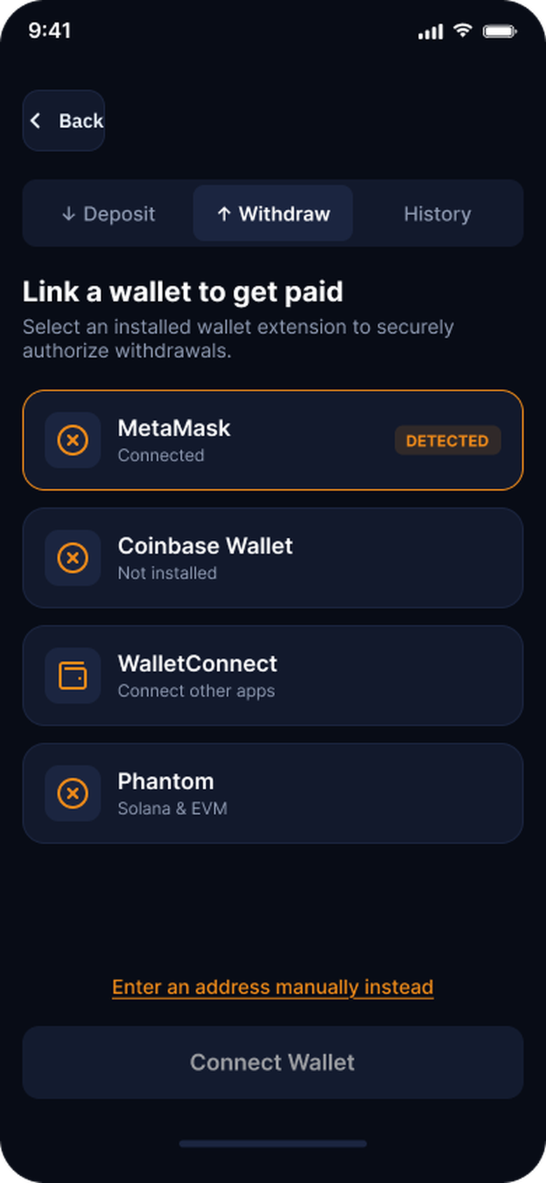
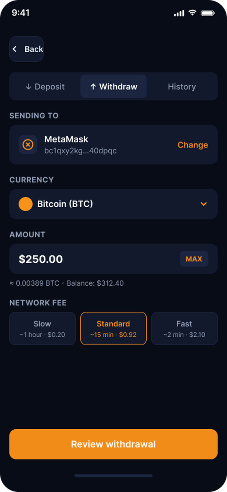
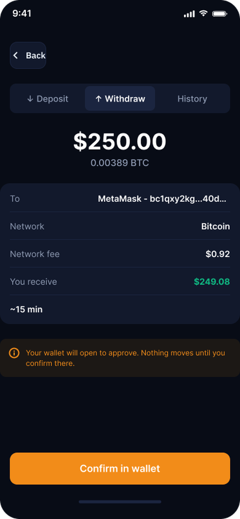
The current state was a Fortris iframe dropped into an account page.
Leadership had decided to bring the cashier in-house, to stop being limited by the vendor and to stop paying for it. The bill: roughly 3 weeks of research and 4 weeks of engineering, plus owning compliance, uptime and every future wallet integration ourselves. I inherited the decision and the bill.
- Users picked a “wallet” that was really a coin.
- Everything was typed by hand, hopping between apps.
- Identity checks (KYC), the highest-stakes step, landed randomly in the middle.
- Every step asked for trust. Every step caused uncertainty.
The brief, in total: “Build a new crypto cashier and make it better than what we have.” No metric, no scope, no user.
My first job was deciding what “better” meant. To me: the user never has to wonder whether their money moved.
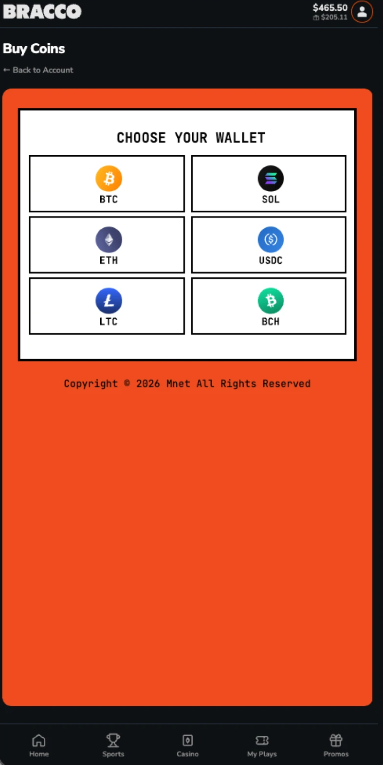
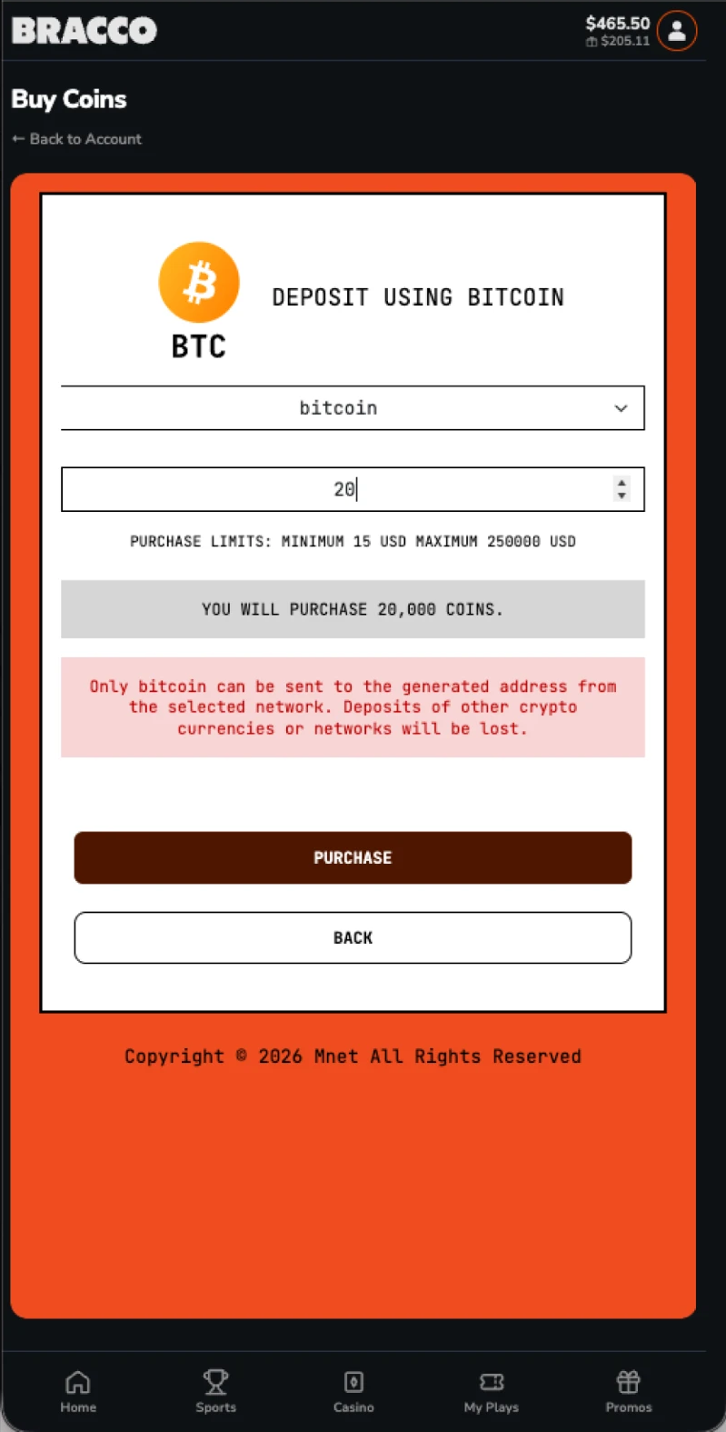
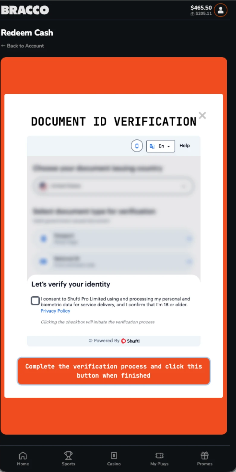
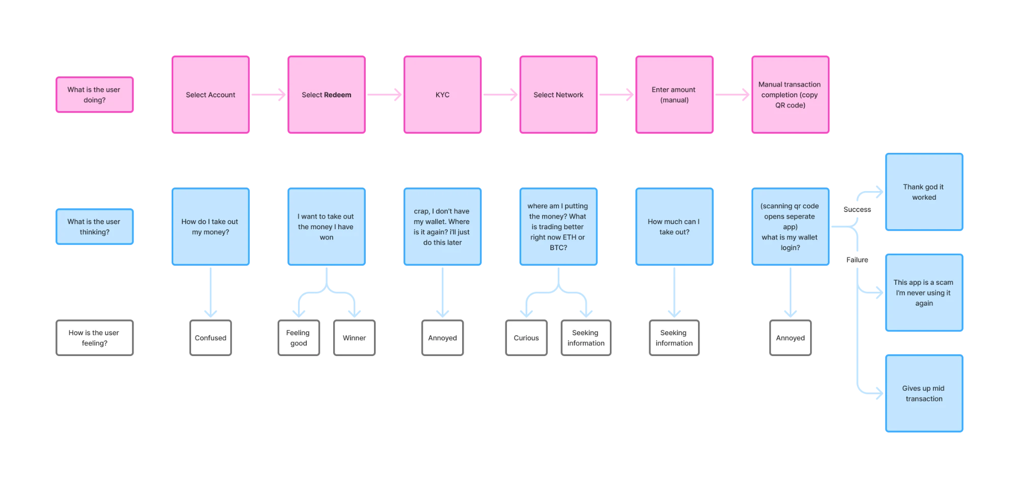
Trust is system status, shown before the user has to ask.
The first of Nielsen Norman Group’s usability heuristics is visibility of system status: keep users informed with timely, appropriate feedback. With money in flight, that means two things on every screen.
- A state: idle, validating, pending, confirmed, or failed.
- A status the user can verify: a confirmation count, a transaction link, a fee shown before commit.
The rest of the screens follow from four standard heuristics: prevent errors, show rather than ask users to remember, speak in the user’s words, treat failure as a state with one next action.
Four rules, every screen.
Every screen in the new cashier is a state with a visible status, so nobody has to guess what is happening with their money.
Three decisions
One coin, not six. The brief was “build a better cashier.” The COO wanted the widest payment funnel: more coins, more ways to deposit. I had no access to the vendor and couldn’t verify what they supported or how the coins were used. I made a different bet: we were losing people on completion, not on choice, and one coin with a flow users could finish would move more money than six they abandoned. The cost was funnel breadth, and the COO’s goal, which I couldn’t validate. If drop-off was really about coin availability, this was the wrong call.
MetaMask first, not a coin picker. My first prototypes were the vendor flow with better UI. When I got in front of users, the complaint wasn’t the screens, it was typing everything by hand. Nobody had put a wallet integration on the table. I made the case for it; the COO wanted the picker users already knew, which is a legitimate argument. We tested both. The integration won on time to completion.
Withdrawal before deposit. Someone putting $5 into a sportsbook has already written it off. A deposit that fails is annoying. A withdrawal that fails is the moment the whole product becomes a scam in their head. The risk was asymmetric, so the two weeks went where the downside was unbounded. Deposit came second.
Four rules shaped every screen. Click through them below.
Most mistakes in the old flow came from typing an address. So the screen leads with what the phone already knows.
- 1MetaMask was detected, so it is pre-selected. One tap, nothing to type.
- 2Typing an address is still possible, as a secondary link for the few who need it.
Every decision that affects the transaction is made on the screen that shows it. Nothing lives behind a settings page, so nothing has to be remembered.
- 1The destination wallet, with Change right beside it.
- 2Amount, balance, and fee tier together. Edit any of them in place.
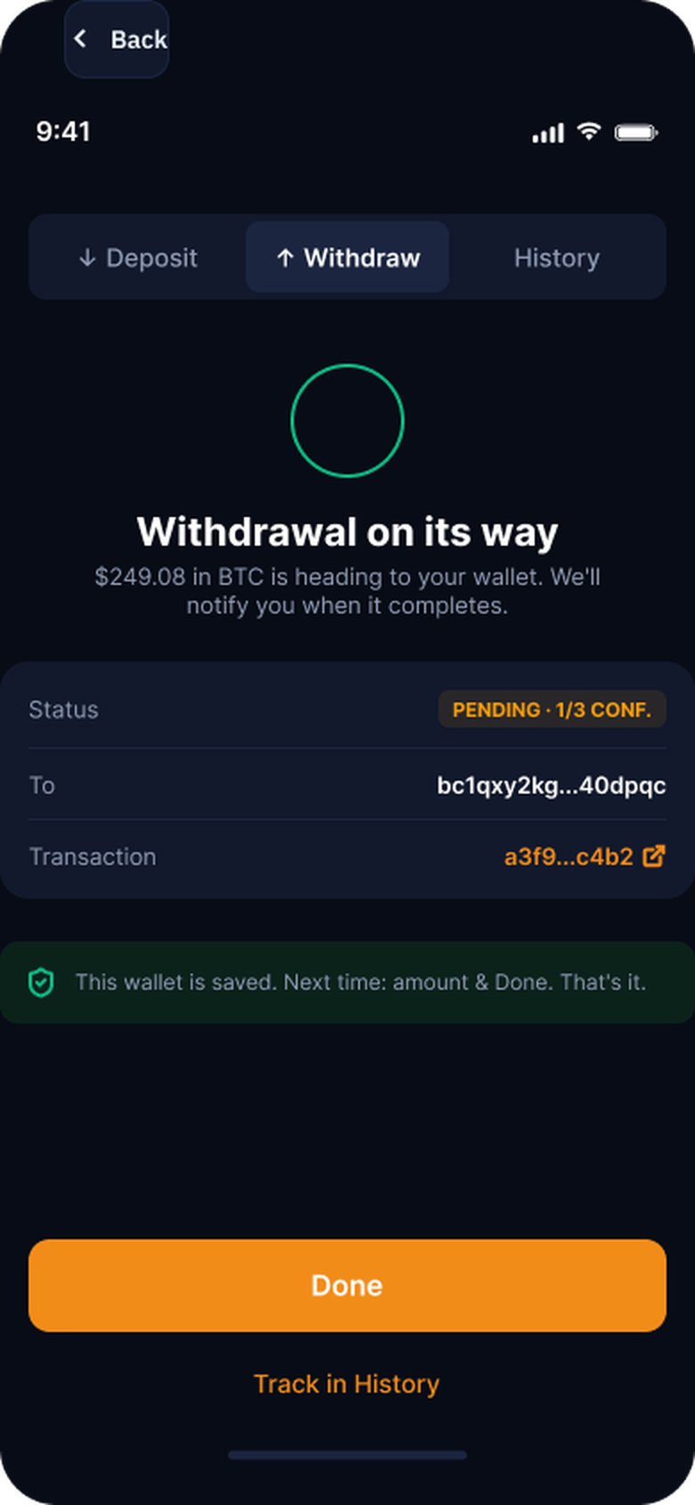
Once money is in flight, silence reads as failure. The screen keeps answering the only question that matters: where is it now?
- 1A pending badge with the confirmation count, the destination, and a link to verify on chain.
- 2The wallet is saved, and the screen says what that means next time.
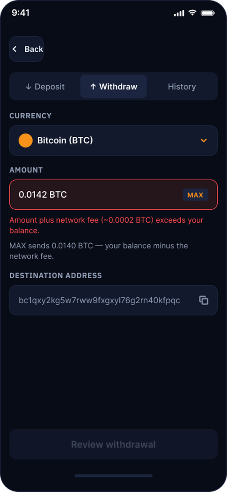
The interface catches the mistake before the user can submit it.
- 1The field turns red, says what is wrong, and says what MAX would send instead.
- 2The primary button stays disabled until the numbers work.
A few scenarios I worked through, and what each one taught me about designing for money in flight.
The user closes the app mid-transaction
Money in flight does not wait for the app to be open.
- The pending state survives the app closing.
- The status is mirrored in history.
- A push notification closes the loop when it confirms.
Coming back never means starting over.
The connected wallet changes between sessions
Browser wallets switch accounts silently. I added a wallet-changed state that does three things.
- Shows the new address.
- Says plainly that it changed.
- Asks the user to confirm it or reconnect the previous one.
One screen, two safe exits.
The network fee moves between review and confirm
Fees are live.
- If the quoted fee changed before approval, the review sheet re-rendered with the new number.
- The wallet never shows a figure the user has not already seen.
The rule: the app never lets a number surprise the user.
What I’d change
The research that found the wallet problem came in week two and cost a week of rework. Run first, it would have cost three days. I asked for it, was pushed to skip it, and didn’t make the case in those terms. Now I would.
I handed off the full flow with every state specified and tested on prototypes. The contract ended before launch, so there are no production numbers.